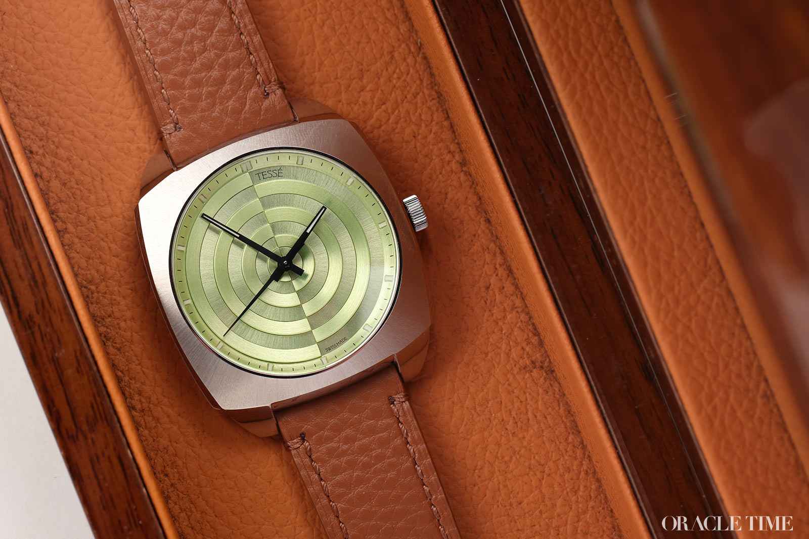
The 1970s is the decade that just keeps giving. But rather than just drawing from the same Genta-shaped well, some intrepid brands have started aesthetically branching out, and not just towards other watches of the era. Architecture, for example, is a bit of a favourite and that’s precisely where Tesse’s latest (and spoiler, greatest) draws its aesthetic quirks from. And it’s not subtle about it either; it is, after all, called The Architect.
The action is obviously on the dial and honestly, it’s incredible. At a glance you might assume there’s some kind of hardcore engraving going on here, machining out tranches of the dial to get this spectacular series of concentric semi-circles. But that would take a very, very big chunk of metal to start and likely be a massive pain. Instead, Tesse have applied these semi-circles to the dial.
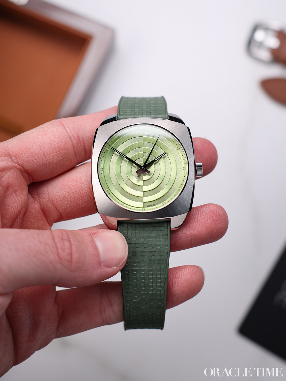

Not only does that give more depth and structural presence to the arrangement, but it also means the various colourful curves can be polished up before they’re added to the dial. The result is this incredible, three-dimensional arrangement that is unlike any other watch dial I’ve come across – and I’ve seen a lot. I’ve heard some people saying it’s reminiscent of a construction site, but not one that I’ve ever come across. It’s too regular and there’s not that usual group of builders watching one guy use a pneumatic drill for five hours straight. To me, it comes across more like an outdoor art installation, something far bigger and grander than you can generally fit on a watch dial.
As a result of all that polishing of tricky components, the colours are fantastic. Tesse has really played up to the way those semi-circles catch the light with a range of rich hues. The pink and pistachio look great, the orange is funky as all hell, and even the black is nuanced in a way your average black opaline can only dream of. What we have here however is the blue – the Neon Blueprint, to be exact.

The blue is the most interesting colour because of its handset. The other versions all have handsets where all seconds, minutes and hours are all the same colour, even if that colour changes from watch to watch. The Neon Blueprint instead has a blue minute and hour hands with a bright red seconds. The first two avoid blending only by virtue of their white lumed tips, but that seconds hand really pops. I’d have liked to see them do this across the board, really, but at least it’s here on what’s undoubtedly going to be the most popular colour.
The dial is the highlight, but the case is no slouch either. Measuring 40mm across and lying somewhere between a cushion and a tonneau, it has that 1970s machined look to it paired with some serious retro wrist presence. Grooves along the caseband amp up the retrofuturism like it’s a prop from Fantastic Four: First Steps, but otherwise it’s all broad, brushed surfaces and polished lugs. It’s not as novel as the 21-piece dial arrangement, but the two pair together perfectly.
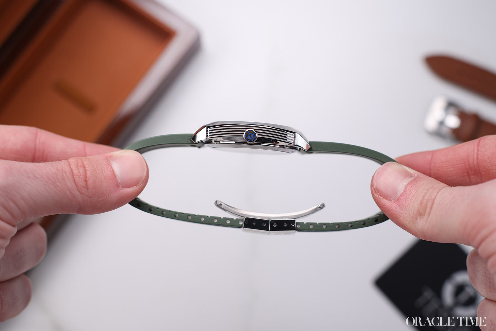
One of my only issues with the case is the crown. On the one hand the size looks good and keeps the silhouette nice and svelte, tapping into that minimalist tonneau vibe. On the other, it’s a bit of a pain to actually use. The very gentle curve of the case sides means it’s harder than your average circular watch to get your fingers around. It’s useable of course, it’s just a bit more awkward than it perhaps needs to be. A wider, chunkier crown would help a lot.
I have to say, I’m also not a huge fan of the straps The Architect comes with. They’re serviceable leather numbers, vaguely matched to the dials, but they just don’t have any real impact to them. Building a bracelet for something like this is easier said than done, but I do think it needs it. A full-metal backdrop would set off the dials even more. As it is, I’d at least be swapping onto a brighter, bolder strap, perhaps in textured rubber.
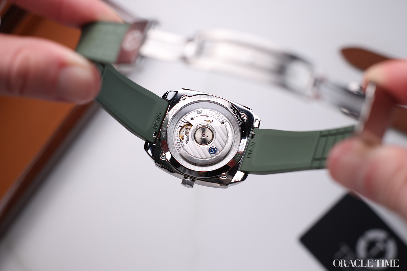
Inside is the ETA 2892-A2 Elaboré, which other than the La Joux-Perret movements appearing more frequently, is the top-end for a third-party microbrand movement. That means a 50-hour power reserve, 4hz frequency and a touch more finishing than its contemporaries. You can see it through the sapphire caseback and it’s nice, but nothing you’ve not seen plenty of before. More importantly, an ETA at this price point is surprisingly good.
The standard price for The Architect is £1,150. For any watch with an ETA movement, that’s ok, but for something unique like this, it’s incredibly tempting. The ‘70s case is bang on the money (accounting for 50 years of inflation, of course) and the dial is one of the most inventive microbrand options I’ve seen for a while. It’s surprisingly simple in execution but the results are stunning.
Price and Specs:
More details at Tessé.


i had to think about this one. I pretty much really do love the watch. And your right the strap is a big question. The green is fine but the brown leather is not. Very big difference. A bolder (not necessarily brighter mor colorful) is called for. maybe its as simple as a simple but well done bracelet. I guess i would have to try it on.
Hello. Thomas here, founder of Tesse Watches. We have been working on a bracelet for quite some time now, and it will be coming out later this year. As with everything else, I didn’t just wanted any generic bracelet, and it is taking us a lot of time to get everything like I envision, with the features and finishes that matches the same level of details and precision as the case and dial construction. Stay tuned ;)