
Since it was revived a couple of years ago by the LVMH group, the reinvented Daniel Roth brand has steadily been paying homage to the original watches of its namesake brand. If you’re unfamiliar, Daniel Roth is the 1980s-1990s eponymous brand of legendary independent watchmaker Daniel Roth, known for his use of the double ellipse case shape. He created several variations of the design and now the modern Daniel Roth is following in his footsteps one watch at a time. We now have the Extra Plat Souscription.


If you’re keeping track of the historical Daniel Roth models that have inspired the modern brand, the original Tourbillon Souscription was released in 1989 as the debut watch for the brand. The Extra Plat Souscription is then inspired by a watch that launched only a year later in 1990, the 2107/C107, the brand’s first time only ultra-thin watch. Of course, the modern watch and its inspiration aren’t a one-to-one match because the aim of Daniel Roth today is to modernise the designs with updated specifications thanks to the cutting edge horology of the La Fabrique du Temps Louis Vuitton manufacture.

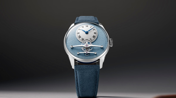
What that means is it has the same updated double ellipse case as the Tourbillon Souscription that proceeded it. Dimensions of 38.6 x 35.5mm make it very svelte on the wrist and due to the absence of a tourbillon they’ve reduced the thickness to a sleek 7.7mm. Roth was famously a fan of ultra-thin concepts and indeed he can be linked to the popularity of ultra-thin watches in the 1990s just as Gerald Genta can be linked to integrated bracelets in the 80s.


For the dial, they’ve gone for yellow gold to match the Daniel Roth Extra Plat Souscription’s case with a hand-engraved guilloché design. Specifically the central disk of the dial and the outer ring feature Clou de Paris, also known as hobnail, produced using an antique hand-operated straight-line engine. There’s then a second form of guilloché around the borders of the chapter ring with hour and minute scales, which is called filet sauté, a style of crimping.

The Roman numeral hour markers, logo and serial number are all printed in a rich blue colour, designed to match the tone of the thermally blued hands at the centre of the piece. The hands themselves are surprisingly minimalist with simple arrow tips, functional and smart. No extravagant Breguet hands here or shapely, carefully wrought feuille designs.


Inside the watch is a brand new movement, the DR002, the second bespoke movement created for the brand at La Fabrique du Temps Louis. It has a 65-hour power reserve, which is great, and operates at a 4Hz frequency. More than that it’s also beautifully finished with a combination of perlage, anglage bevels and Côtes de Genève. Although you unfortunately can’t admire the attention to detail without opening the solid caseback. Back in the day Roth did produce some of his watches with exhibition windows so perhaps the brand inspired by him will eventually do so too.
The Daniel Roth Extra Plat Souscription is limited to 20 pieces at CHF 45,000 (approx. £40,240). What’s perhaps even more exciting is that if it follows the same pattern as its tourbillon cousin, we may see a non-limited version released in the future, making Daniel Roth designs more accessible than ever. If you have a spare 40k lying around.
Price and Specs:
More details at Daniel Roth.


We seem to be at a point where watch making artisans appear to be vying for the pinnacle point of being recognized as the most highly skilled craftsman within their profession, by virtue of creating something that without doubt has beauty and being technically superb, but out of reach of the normal person. Yes, you can argue that this has always been the case, you only have to look at the creation of the Fabergé eggs to see this point, but I think things are currently getting a little out of hand.
Now to the watch. – it’s nice to see that gold is being used again, but, limited to the case only, and not on a bracelet, just the right balance. Moving back to the case, the overall round edged form and use of a second plimsole-line case banding forming a gorgeous “swell” just oozes elegance. The choice of strap colour complements the case superbly. Now, here comes the rub. The dial IMO, is too fussy, the Marcella facing is completely wrong in the dial colour chosen (white or champagne colour would be the right colour choices using Marcella). The decision to use Roman numerals hour markers, is also wrong, (dagger style would have been better). The dial design detracts from the beauty of the case, simplicity of the dial would have let the case be the main feature that it wholly deserves to be.
Seems to be a committee design, you can virtually hear the discussion around the table – yes, the case is super, but how about adding a Marcella facing, oh, let’s do it in gold to match the case colour etc. All spoiled due to over thinking and showcasing multiple skills that should have been pared-back. The watch would have benefitted by the “less is more”principal.