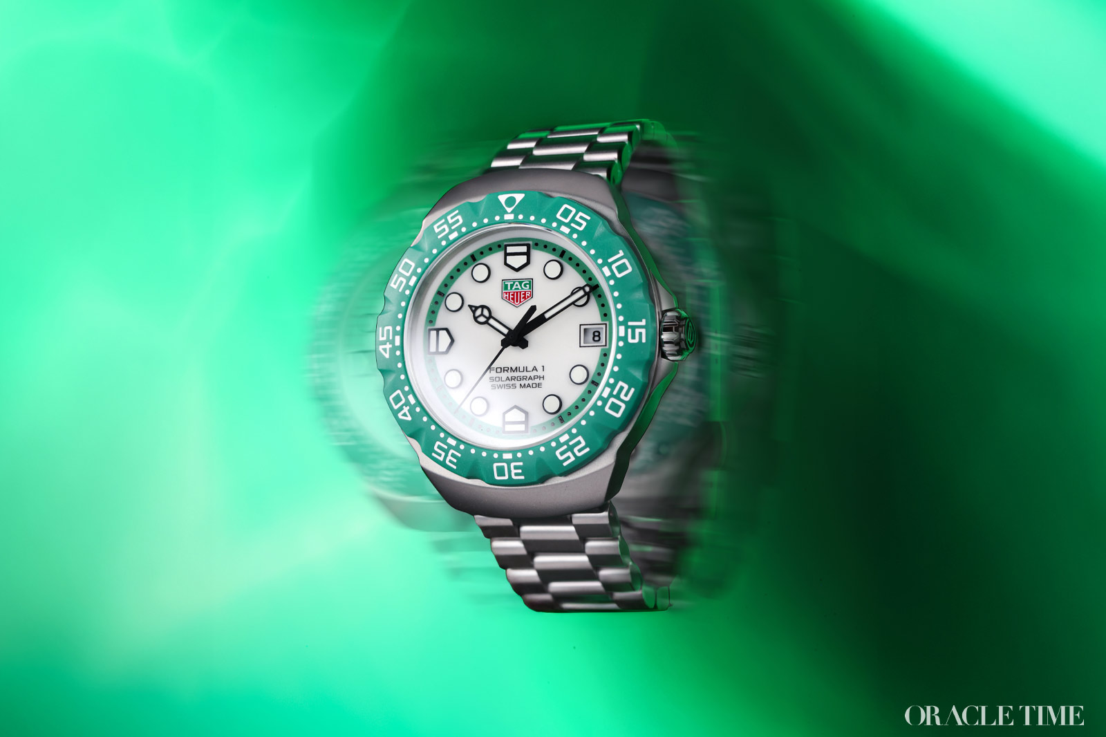
The quartz crisis did a lot for the watch industry. Oh, nearly all of it was bad, obviously. Brands shuttered left and right, unable to outlast the onward march of battery-powered tech and many of those that remained turned their sights to cheap mass production instead of genuine watchmaking. For others though, it was a brave new world. Seiko, heralds of the apocalypse as they were, ended up doing just fine and Swatch quickly redefined what a watch even was with their cheap, colourful designs. Indeed, the seismic shift resulted in some of the definitive watches of the 1980s – none more so than the TAG Heuer Formula 1. So, with TAG Heuer now taking over from Rolex as the timekeeper of the world’s fastest car race, let’s take a look at the collection that cemented that relationship more solidly than rectangular watches and Monaco.
Back in the 1980s, Heuer had a solid range of diving watches under their belt. The progenitors of the Aquaracer – the 1000, 2000, and 3000 series – were doing well and showing that there was still a hunger for proper tool watches, even ones with extraordinary, eye-catching bezels. But this was the ’80s and the ’80s loved one thing above all, something that Heuer’s professional divers were missing – colour.
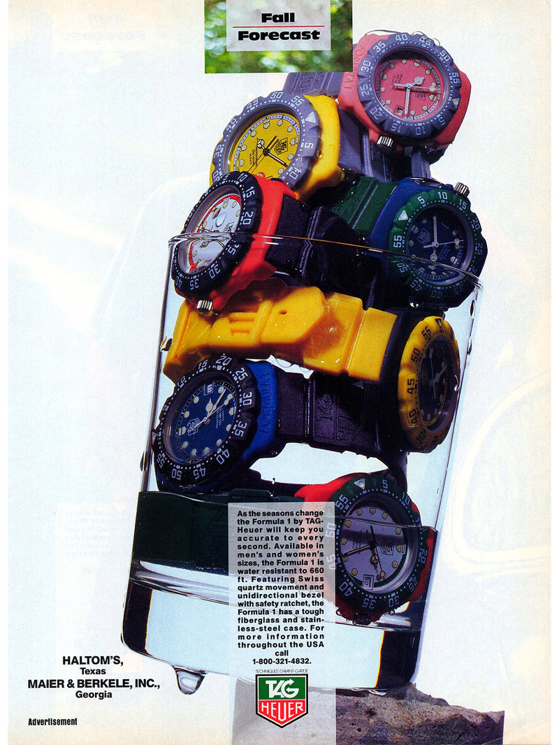

Tag Heuer Formula 1 Adverts (1980’s/1990’s)
So, Heuer enlisted Eddy Burgener, the designer behind many of their watches of the era and gave him a simple brief: to build a new watch that was young, colourful and fun to compete with the big, accessible quartz producers like Casio and Seiko. And perhaps more surprisingly, the first port of call for inspiration wasn’t the track but the beach. At the time, Casio were killing it with cheap, waterproof watches aimed at the surfing crowd and, in the mid-80s, they’d started bringing colour into the range, too. Heuer took a look and decided that, with their diving pedigree, they could go one better.
The new watch needed the requisite diving specs, including a grippy unidirectional rotating bezel, plenty of legibility, and 200m water resistance. The problem is that those sorts of specs are hard to do in the kind of board short colours that Heuer wanted. And so, they opted for an undercase in stainless steel clad in what would become the defining feature of the first Formula 1 watches, their synthetic, fibreglass outer cases and bezels. Even that was easier said than done, as they needed to develop a specific fibreglass spring for the bezel, but the result was eye-catching colour through and through.
The water-proficient theme carried through to the straps too, which were made of injected PVC to perfectly match those bezels. They were supplied extra-long specifically so that they could easily be worn over a wetsuit, but this meant that most non-surfers would need to cut them down to size. And so, they were given v-shaped grooves to make that much, much easier.
All of this however, leads to one glaring question: what’s with the name? If the original brief was an accessible dive watch for a younger audience and so much of the design was informed by what surfers might need, why was it called the F1?

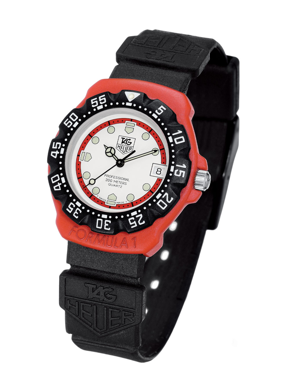
Tag Heuer Formula 1 (1987)
There’s a rumour that some of the design inspiration came from an F1 car, but the real reason is much more straightforward. It’s all about marketing. During the development of the watch, Heuer became a sponsor of the McLaren racing team, and they wanted everyone to know. The launch of a brand-new collection was the perfect opportunity and so in 1986, both the racing partnership and the TAG Heuer Formula 1 collection were born.
Quick aside, you’ll notice this is the first time I’ve used the TAG before Heuer in the timeline. That’s because it was actually in 1985 that Techniques d’Avant Garde acquired the historic Heuer name. How that affected the brand moving forwards is open to speculation, but at the very least, it was this year that the modern brand was built – thanks in no small part to the launch of the Formula 1.

Tag Heuer Formula 1 Advert (1991)
The first watch was launched in just three colours. Evidently TAG Heuer were testing the waters and you can see why; these were as close to their previous watches as a hot hatch is to a vintage 911 and not just when it came to the movement. The bright reds and greens, the high-contrast blacks and whites, those intense fibreglass bezels, all added up to a watch that was designed to make a splash, metaphorically and otherwise.
Just a year later, TAG Heuer expanded into a dramatically wider palette of colours. Bright blues, yellows, and oranges in monochromes and high-contrast combinations, 28mm ladies’ versions and steel cased versions, it was an intense expansion. If 1986 was dipping a toe in, 1987 took the real plunge – and in the process the Formula 1 became the ‘proper’ watch of the 80s.
In the years since that initial, colourful flurry of watches, the Formula 1 became TAG Heuer’s entry-level collection and over time got a little more aesthetically serious, opting for blacks and steels over the older, funkier versions. It was the first watch of far too many Essex lads that couldn’t afford their first Rolex yet and honestly, until recently I had kind of put it out of my mind.

Tag Heuer Formula 1 Kith (2024)
Over the last few years, however, colour has been on the ascendency and the Formula 1 has been overdue a return to form, which it did in the form of last year’s collaboration with lifestyle brand Kith. The run of authentically retro, colourful Formula 1 models blew up a storm. And I mean authentic; the limited-edition run used the same tooling as the original pieces, in 35mm, small by today’s standards but decently big in the ’80s. Cards on the table, the only reason I didn’t buy one myself was decision paralysis. Did I go for the multi-coloured green, blue, yellow and red version or something a bit more everyday? That decision was very quickly taken away from me.
If you want to gauge just how perfectly the collaboration nailed it, take this into account. While each watch was priced around the £1,300 mark, the full set of 10 watches went to auction via Christie’s back in the spring. The result? CHF 50,400, or about £45,000. Compared to the total £13,000 initial price tag, that’s a pretty good return on investment.

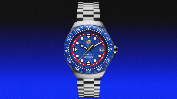
Tag Heuer Formula 1 Solargraph Collection (2025)
With success like that, it was inevitable that TAG Heuer would re-evaluate the ’80s classic under their own steam, which they did earlier this year at Watches & Wonders and the launch of the new, revamped and broadly colourful Formula 1 Solargraph.
Rather a millimetre perfect reissue of the ’86 version a la Kith, TAG Heuer has revamped the Formula 1 for modern wrists. Firstly, the majority of models here use steel over synthetic materials. Even the black is DLC-coated, which is what you’d expect from a modern watchmaker. It feels more solid and with the matte finish looks just as retro.
Obviously with DLC being black, the blue and red cases need another solution. So, they use bio-polyamide, a synthetic composite that’s a massive upgrade from the old fibreglass. It’s much more rugged and has been used on both those coloured cases and the coloured bezels on all the models. Because while they might be a bit more reserved than the ’80s Formula 1 collection, colour here is still king.
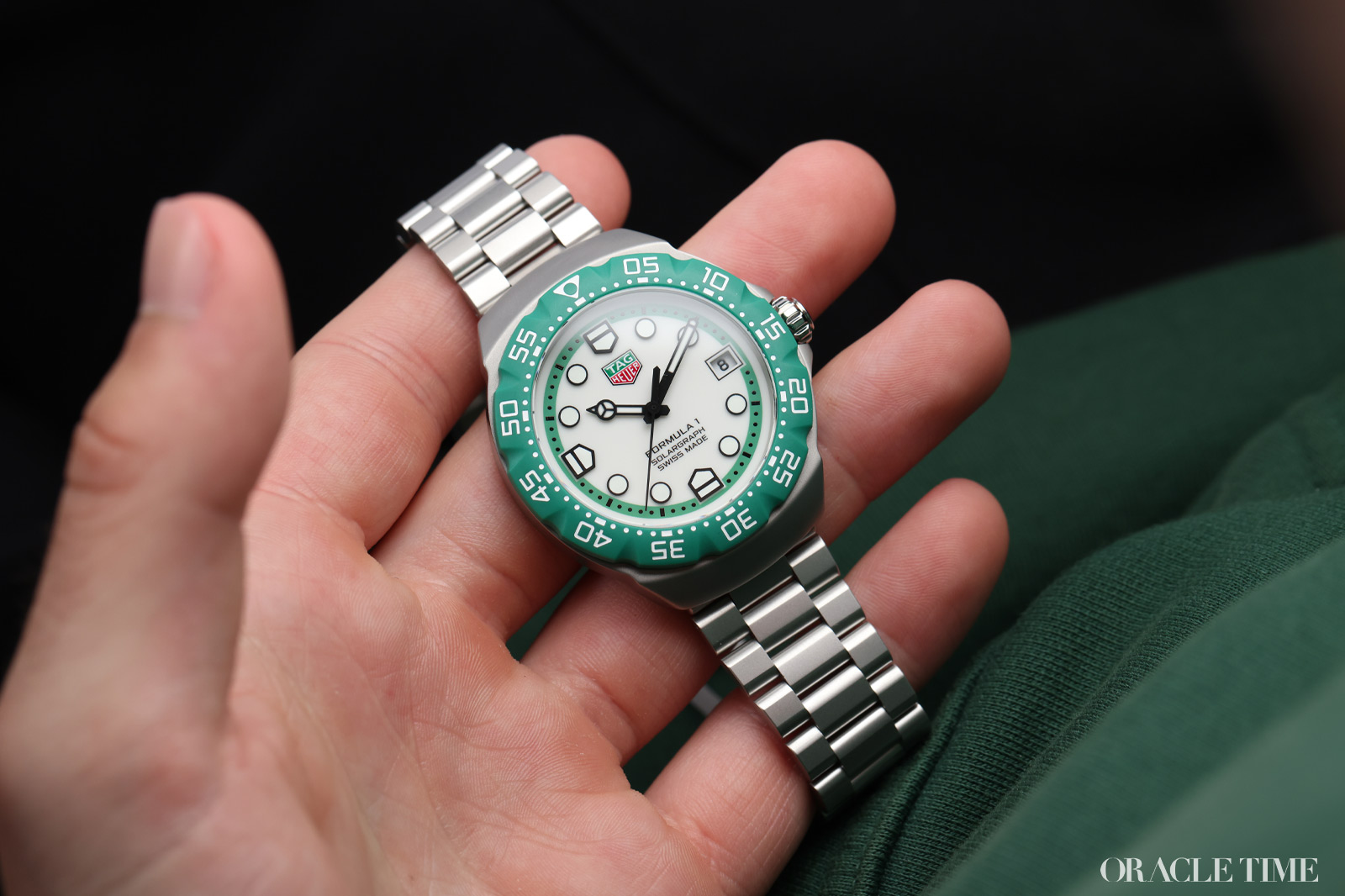
Tag Heuer Formula 1 Solargraph Silverstone Edition
There are currently nine watches in the Formula 1 Solargraph collection in a host of combinations of black, white, red, yellow, green and blue. They’re bright, but there’s nothing too kitsch here, and for a good reason. This time, the Formula 1 has been defined by TAG Heuer’s racing connection as many of the watch colours pay tribute to very specific Grand Prix races.
The cool black and yellow version for example, will be sold for the Mexico Grand Prix, the blue case with white dial for Singapore, etc. Closer to home – both because it’s the British Grand Prix and because of our cover – the green and white version is dedicated to Silverstone. It’s a novel way of selling them but more importantly, it’s one hell of a watch to take home post-race, whether or not your team wins.
There are other modern nods too. The size has been upped from 35mm to 38, a significant jump but one that most of us were expecting and honestly, appreciate. I prefer smaller watches in general, but with the chunky bezels (bi-directional now, incidentally) and dimensions here, it begs for a larger size. I’m just surprised they didn’t go slightly more extreme with a 40mm. It is worth noting that as it’s no longer designed for the sea, the water resistance is 100m.
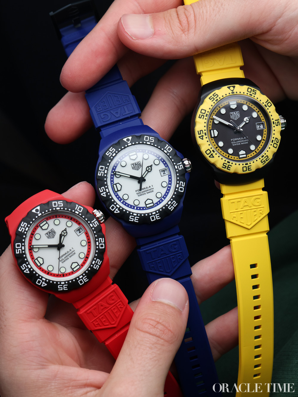
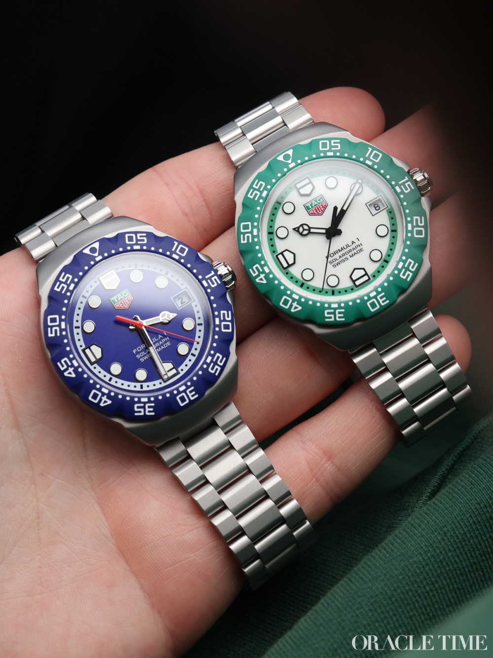
The movements too have been updated. As the name suggests, the Solargraph TH50-00 is a light-powered movement akin to the Citizen Eco-Drive. Basically, it has all the benefits of quartz – insane accuracy and reliability – but without the need for a battery. Two minutes of sun can power it for a whole day; 40 hours will power it for 10 months. The battery will still need to be replaced, but every 15 years instead of 15 months.
Now, the big thing: price. The original Formula 1 was ultra-accessible but still considerably more expensive than the likes of Swatch, the trade-off between being affordable and practical. The Formula 1 Solargraph is aiming for the same thing and at CHF 1,750 for a rubber strap and CHF 1,850 for a bracelet – about £1,575 and £1,670 respectively – it’s in the right ballpark.
Sure, there are cheaper quartz watches out there (by a good margin) but this is still TAG Heuer. And where other quartz watches might just have colour, here that’s paired with a superior movement, an iconic, era-defining design and an indelible tie to racing culture. Not bad for what was originally going to be a surfing watch, is it?
More details at Tag Heuer.