It seems like the wave of integrated bracelet sports watches that began in 2021 seems to have long since crested, with most major brands having already thrown their hats into the too often Genta-inspired ring. It’s a bit of a surprise then that it’s taken British brand Farer quite this long to join them – and perhaps even more of a surprise that it might be their best watch to date: the Farer Integra.
While the name’s not exactly the most original out there, the way Farer has approached their shiny new collection is relatively distinctive. If you’re expecting industrially machined edges and visible screws think again. For once, this is not the kind of watch to evoke Genta’s name. In fact, the 38.5mm tonneau case is more gently curving than most. It’s kind of what you get if you take the Bell & Ross BR-05 and reconsider it as a dress watch.
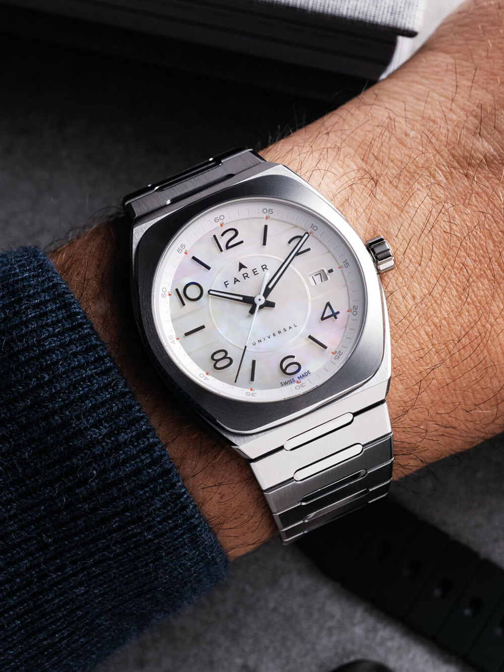
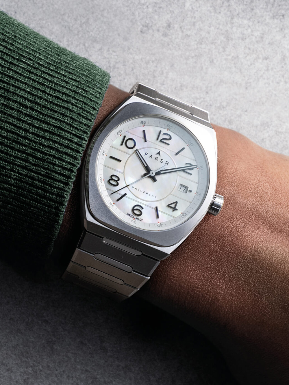
It still ticks all the canon boxes of course. The bezel outlines the case shape, the bracelet blends nicely into the case, giving it a svelte lug-to-lug of 42mm. Between that and the bellytanker construction (the exhibition caseback extrudes from the back) it sits as well on the wrist as any of the big integrated players. Yes, it’s sporty, but at 10.3mm thick it fits under a shirtsleeve nicely, amping up the go anywhere, do anything vibes.
My biggest issue with the Integra is the engraved horizontal lines on the dial. It’s a touch that makes me roll my eyes on anything near the word ‘integrated’. I won’t evoke names, but you know what oft-imitated watch I’m thinking about. Farer manage to avoid too much of a comparison to that watch in two ways. Firstly, the dial’s broken up by a central grained mid-section, which adds a nice textural mix-up and helps frame the large numerals and indexes around the edge.


The slightly cooler reason I’m on board with the lines however is their continuity. In the same way the case transitions into the bracelet, that tread continues the entire length of the bracelet. It even carries through the deployant clasp too, an attention to detail other watchmakers can learn from. Incidentally that clasp has one of the simplest and easiest to use versions of micro-adjustment I’ve ever used. The end links just pop out, giving you fractions of an inch more breathing room on either side. It’s less fiddly, more solid and much more satisfying than the usual in-clasp takes. It has the hidden upside of also making the clasp itself slimmer.
If you’re eagle-eyed enough, you might also notice that the tread is also across the rotor of the automatic Sellita SW300-1 movement with its 56-hour power reserve. It’s also, and this is strange, a full rotor. Most automatic rotors cover half the caseback as that ensures that the weight actually moves round, winding the watch. Here, it covers the entire caseback but has been delicately weighted to not lose winding efficiency. Will most people notice? No. Is it obsessive? Yes. But it’s the kind of obsessive touch I love.

As for dial colours, there are four versions of the Integra available. There are the two ‘standard’ versions in a dark, ink blue (Tenebris) and a salmon (Cuprum), both of which are nice, will be popular and don’t interest me too much – they’re not what I want from a brand as visually eclectic as Farer. However, then you have the stone dials.
I’m lumping the mother-of-pearl (Perlarum) into stone by the way as it’s much the same technique. In this case, that pearl is a pristine white that’s subtle enough you may well mistake it for opaline, avoiding the feminine tones that would have most people dismiss it as a women’s watch. It’s essentially a more nuanced take on a classic black and white. Then there’s the malachite (Virdis), a dial that’s become immensely popular for good reason. The slivers of stone Farer are using are suitably dramatic with that signature vari-green grain.
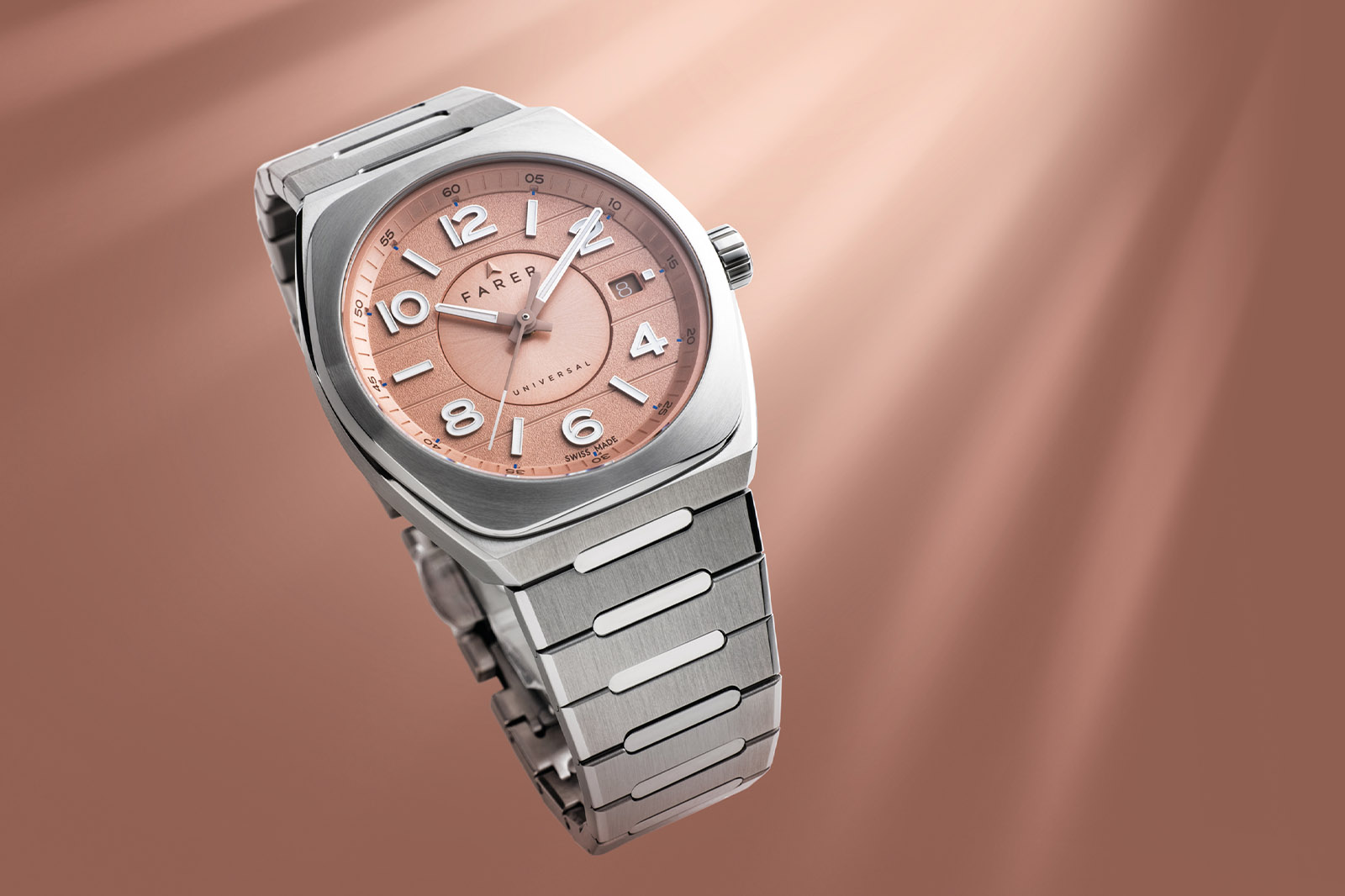
If you have a weird encyclopaedic knowledge of Farer, you might also realise that this is their first three-hander with a date. That’s not really a major point, but it’s still a point worth noting.
Of the lot – and I never thought I’d say this – the pearl is my favourite. From a slight distance, it’s just an interesting white dial. Close up, it’s magnificent, and the use of black numerals (they’re actually black-painted lume rather than the filled numerals on the other dials) stops it feeling too stereotypically ‘luxurious’.
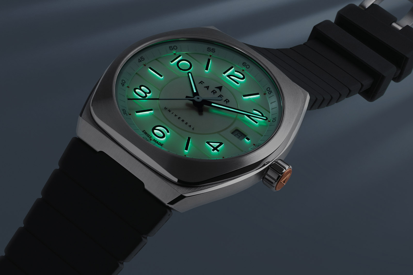
So what will this all set you back? Well, it’s definitely a jump for non-complication Farer at £1,450 for the ‘standard’ colours, £1,550 for the stone. But compare that to anything else in the price range and you’ll be more than pleasantly surprised; you’ll be ordering one. I likely will be.
Sure, I wish there were one or two funkier colourways, but this is just the start for the Integra. Farer don’t do too many complications, but if they’re ever going to this is a fantastic jumping off point. At the very least, it’s Farer’s most confident watch to date.
Price and Specs:
More details at Farer.